Analysis code
Introduction
The data were obtained from a series of randomized replicated experiments. There is one single csv file that contains data from each experiment. All analyses are presented below and separated for each experiment. I follow the steps (not in that exactly order) illustrated in the R for Data Science book (http://r4ds.had.co.nz/) (Grolemund and Wickham 2017). They are: data import and tidy, explore (transform, visualize and model) and communicate.
These are the packages used.
library(tidyverse)
library(here)
library(viridis)
library(ggthemes)
library(lme4)
library(cowplot)
library(broom)
library(agricolae)
library(lattice)
library(emmeans)
library(car)
library(scales)
Perithecia production
Import
Let’s have a look at the raw data.
perithecia <- read_csv(here("data", "perithecia.csv")) %>%
  filter(genotype != "t")

perithecia
The main response variable is ppi (perithecia production index), which was already calculated. It is an index based on the frequency of the scores given by given by: PPI = ((n0× 0)+(n1 × 1)+(n2 × 2)+(n3 × 3)) × 100) / (ntotal × 3) where nx = number of grains in the respective x category (x = 1 to 4 score) and ntotal = total number of grains (25 in this study). However, the original scores are included and consist of the number of grains on each score (0 to 3).
Transform
The frequency of each score is shown in separate columns. To plot and further work with the data, we will need to reshape the data from the wide to the long format, where each frequency of the scores need to be in a single column. We will use the gather function of dplyr. For this, we need to inform the name of columns for the score and frequency variables.
perithecia2 <- perithecia %>%
  gather("score", "frequency", 8:11)

perithecia2
Visualize
We can now visualize the frequency of the scores for each species-genotype separated (facet) for each substrate. This is a nice plot to have in the paper!
g1 <- perithecia2 %>%
  ggplot(aes(reorder(genotype, -ppi), frequency, fill = score)) +
  geom_bar(stat = "identity", position = "fill") +
  facet_wrap(~substrate) +
  theme_few() + # load ggthemes
  theme(axis.text.x = element_text(angle = 45, hjust = 1)) +
  labs(x = "", y = "Proportion of grains", fill = "Score") +
  scale_fill_viridis(discrete = TRUE)
g1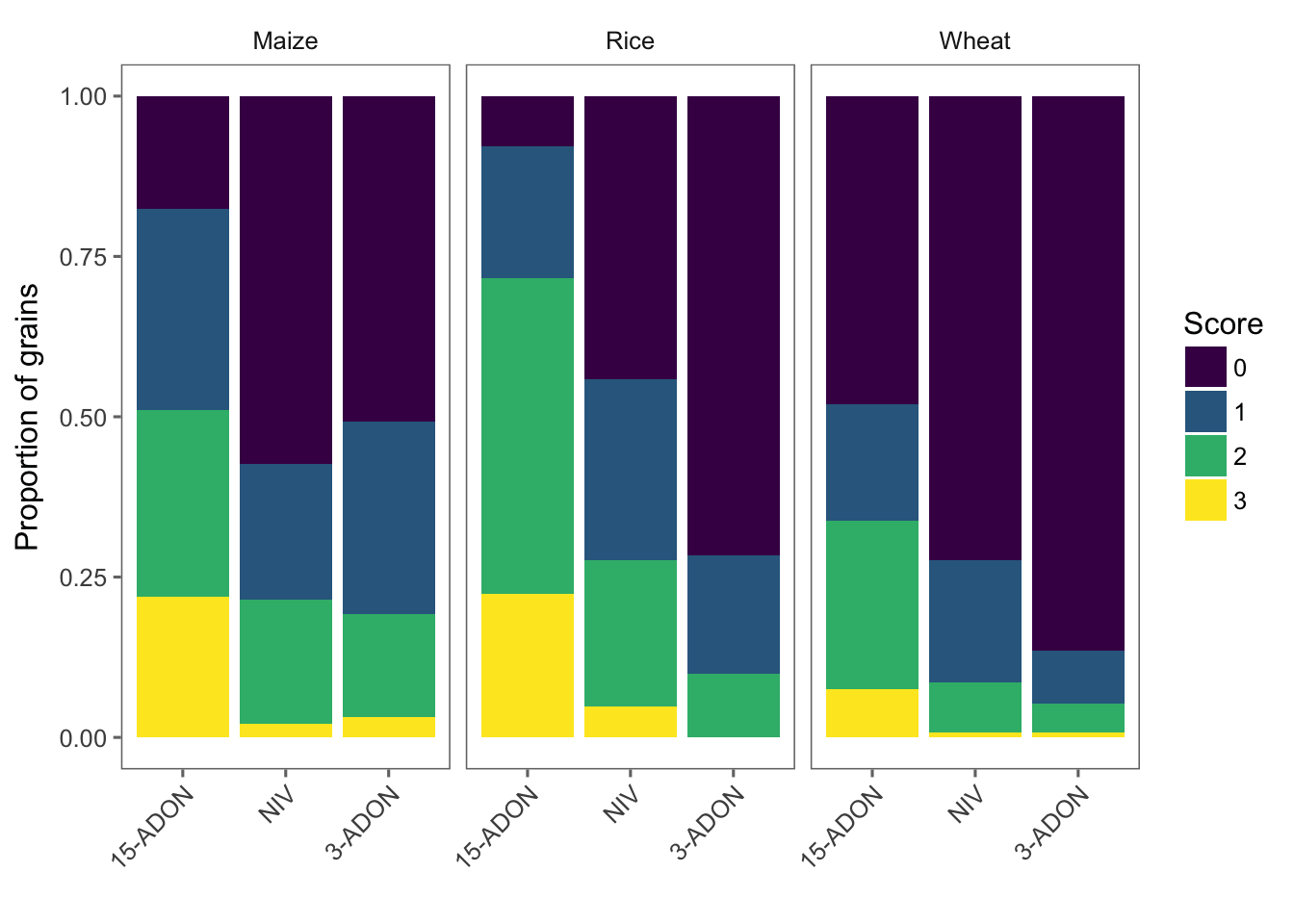
Model
Since we have one species with two genotypes, it may be important, besides testing the effect of species or genotype in the model, to create a species_genotype variable. We will then fit a mixed model to test the effect species_genotype on the perithecial production index (ppi). In this way the two genotypes within one species can be compared between them and among the others. We use the unite function to create this variable.
# creating the variable
perithecia <- perithecia %>%
  unite(species_genotype, species, genotype, sep = "_", remove = F)
Now we can fit the mixed model using lmer function. We treat Isolate as a random effects.
library(lme4)
lmm_per <- lmer(
  ppi ~ species_genotype * substrate + (1 | Isolate),
  data = perithecia, REML = FALSE
)
Let’s check the single and interaction effects using Anova function of the car package.
library(car)
Anova(lmm_per)
Evaluate the model
plot(lmm_per, type = c("p", "smooth"), col = "black")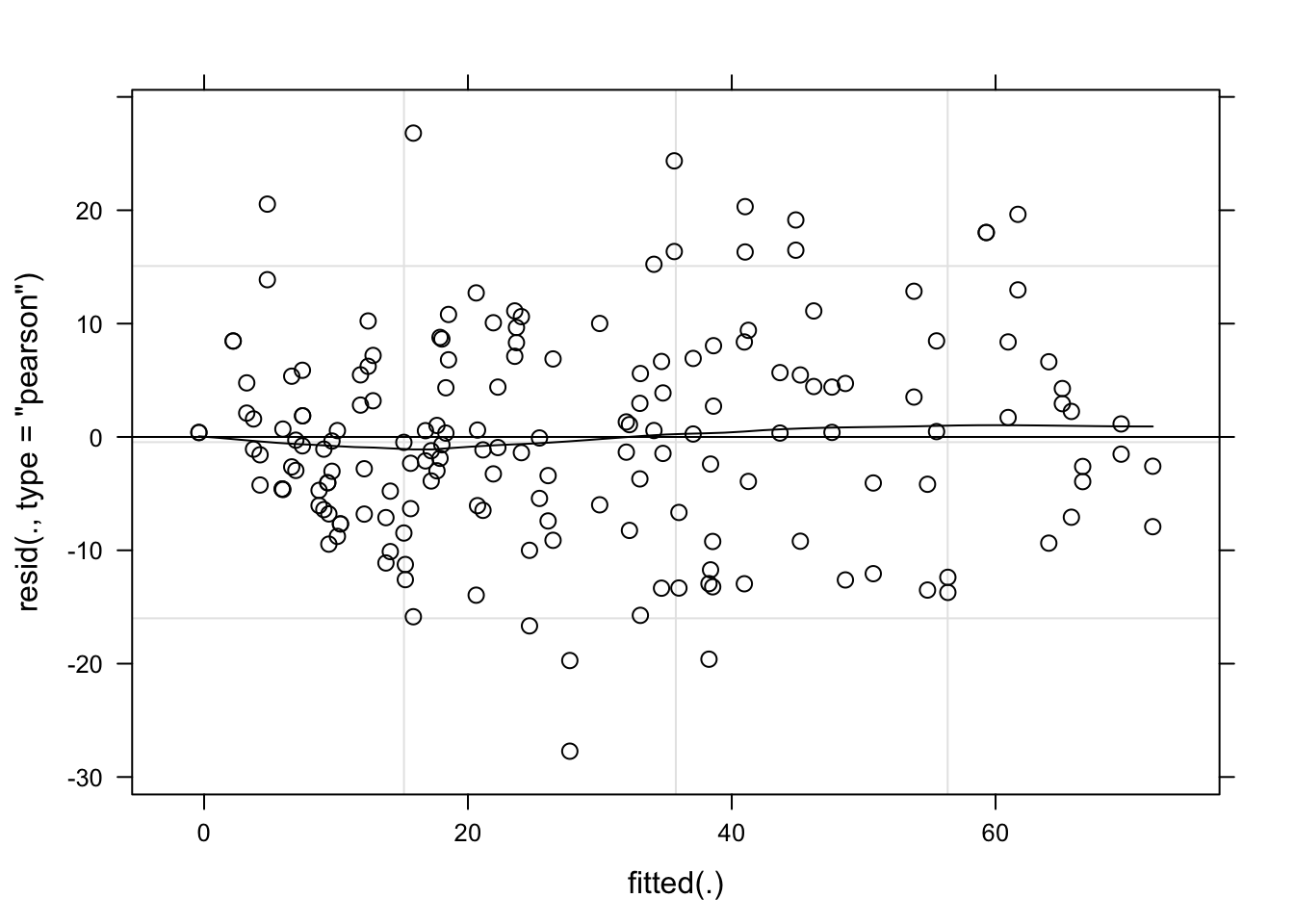
qqmath(lmm_per, id = 0.05, col = "black")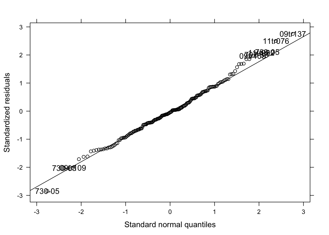
Means comparison
Not too bad. Let’s now compare the means of treatments and create a data-frame which will be use to further create a plot with the estimated means and confidence interval. We will use the emmeans package which is an update for the old lsmeans package. The syntax is the same as before.
library(emmeans)
medias <- emmeans(lmm_per, ~ species_genotype * substrate)
med <- cld(medias, Letters = LETTERS, alpha = .05)

# make output as a dataframe
med <- data.frame(med)
head(med)
Figures
This new med data-frame does not contain the two original variables we want to use to plot the data. Let’s separate the species_genotype variable and create genotype and species. We use the separate function.
med2 <- med %>%
  separate(species_genotype, c("species", "genotype"), sep = "_", extra = "merge")
# extra argument was used to keep the genotype information alltogether
head(med2)
We now can plot the point estimates for the means and respective 95%CI of the ppi for each genotype. We add species legends when using color argument so we can have five species_genotype.
g2 <- med2 %>%
  ggplot(aes(reorder(genotype, -emmean), emmean, color = species)) +
  geom_point(position = position_dodge(width = 0.3)) +
  theme_few() +
  theme(legend.position = "right", legend.text = element_text(size = 8, face = "italic"), axis.text.x = element_text(angle = 45, hjust = 1)) +
  scale_color_viridis(discrete = TRUE) +
  facet_wrap(~substrate) +
  geom_errorbar(
    aes(ymin = lower.CL, ymax = upper.CL),
    width = 0.2, position = position_dodge(width = 0.3)
  ) +
  labs(y = "Perithecia production index (%)", x = "Trichothecene genotype")
g2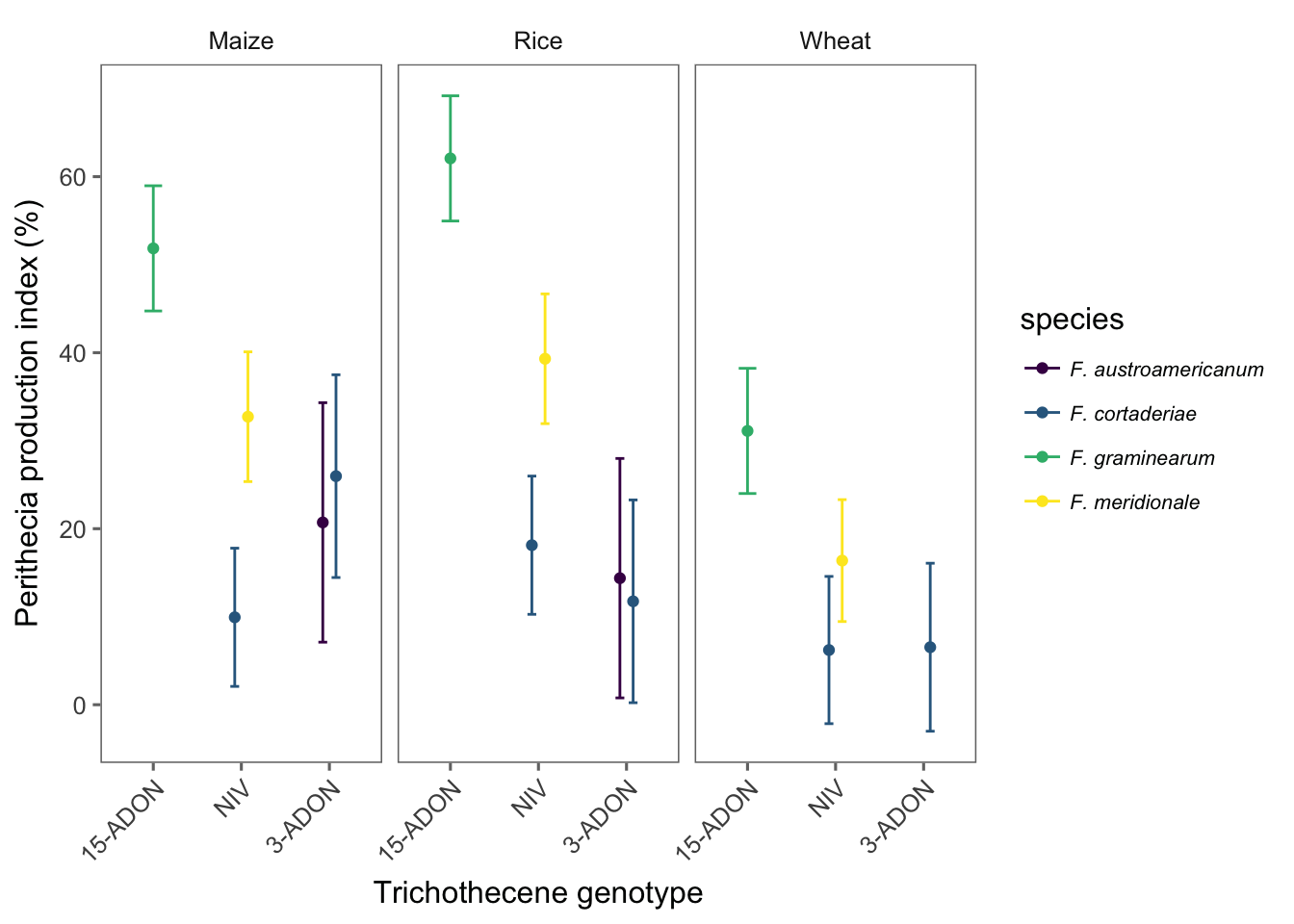
Finally, we prepare and save the Figure 1 of the manuscript which is a combo figure with the the two previous plots for both the original scores and the normalized index. We use the plot_grid function of the cowplot package for this.
grid1 <- plot_grid(g1, g2, labels = c("A", "B"), align = "hv", ncol = 1)
ggsave(here("figs", "figure1.png"), grid1, dpi = 600, width = 6, height = 7)
grid1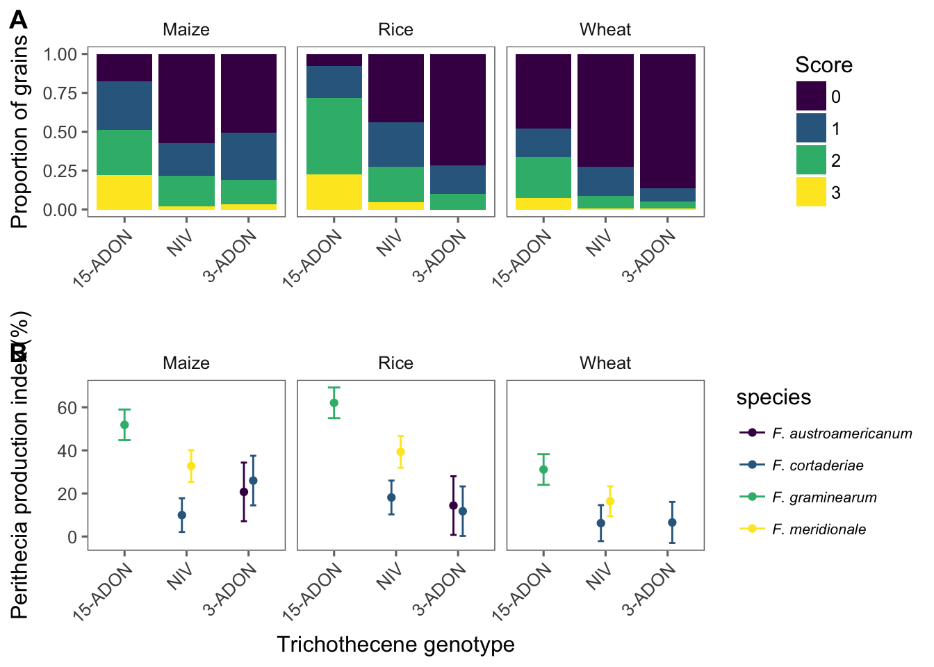
Mycelial growth
Import
The main variable is mycelia growth rate, or the ratio of the growth at the fifth day and number of days. Besides the species and genotype factors, there are two levels of temperatures being tested.
mgr <- read_csv(here("data", "mycelia.csv"))

head(mgr)
Visualize
We can plot means of mycelial growth rate for each species-genotype and temperature as faceting variable. This plot will be included in the publication.
mgr1 <- mgr %>%
  group_by(isolate, genotype, species, temperature) %>%
  summarize(mean_mgr = mean(mgr)) %>%
  ggplot(aes(factor(genotype), mean_mgr, color = species)) +
  geom_jitter(width = 0.1, size = 3) +
  facet_wrap(~temperature) +
  scale_color_viridis(discrete = TRUE) +
  theme_few() +
  theme(
    legend.position = "top",
    legend.text = element_text(size = 7, face = "italic")
  ) +
  labs(
    x = "Trichothecene Genotype",
    y = "MGR (mm/day)", color = "Species"
  ) +
  ylim(0.2, 1.8)
Model
Let’s fit a mixed model for the mgr data. We first test the effect of the interaction.
mgr <- mgr %>%
  unite(species_genotype, species, genotype, sep = "_", remove = F)
lmer_mgr <- lmer(mgr ~ species_genotype * temperature + (1 | species_genotype / isolate), data = mgr, REML = FALSE)
## fixed-effect model matrix is rank deficient so dropping 1 column / coefficientAnova(lmer_mgr)The interaction was significant. We now create different data sets for each temperature and test the effect of species_genotype within each temperature.
# 15 C
mgr15 <- mgr %>%
  filter(temperature == "15")

lmer_mgr15 <- lmer(mgr ~ species_genotype + (1 | species_genotype / isolate), data = mgr15, REML = FALSE)

Anova(lmer_mgr15)
# 30 C
mgr30 <- mgr %>%
filter(temperature == "30")
lmer_mgr30 <- lmer(mgr ~ species_genotype + (1 | species_genotype / isolate), data = mgr30, REML = FALSE)
Anova(lmer_mgr30)We can see that there are no effect of species_genotype in the mgr within each of the temperatures.
Sporulation & Germination
In this experiment, the production of macroconidia and further germination of 20 randomly selected spores of the different strains of the species-genotype combination, was evaluated in two runs of the experiment.
Import
spor <- read_csv(here("data", "spor_germ.csv"))

# again, we create the species_genotype variable
spor <- spor %>%
  unite(species_genotype, species, genotype, sep = "_", remove = F)
head(spor)
Visualize
The code below will produce plots for total macroconidia production and percent germinated spores.
spor1 <- spor %>%
  group_by(species, genotype, isolate) %>%
  summarize(mean_spor = mean(spores_ml))
spor2 <- spor1 %>%
  ggplot(aes(genotype, mean_spor, color = species)) +
  geom_jitter(width = 0.1, size = 3) +
  theme_few() +
  scale_color_viridis(discrete = TRUE) +
  theme(legend.position = c(1, 5), axis.text.x = element_text(angle = 0, hjust = 0.5, size = 7), legend.text = element_text(size = 12, face = "italic"), axis.title = element_text(size = 12)) +
  labs(x = "", y = expression(N.~of~macroconia~x~10 ^ {
    3
  }), color = "Species") +
  ylim(0, 5) +
  guides(colour = guide_legend(nrow = 2))
spor2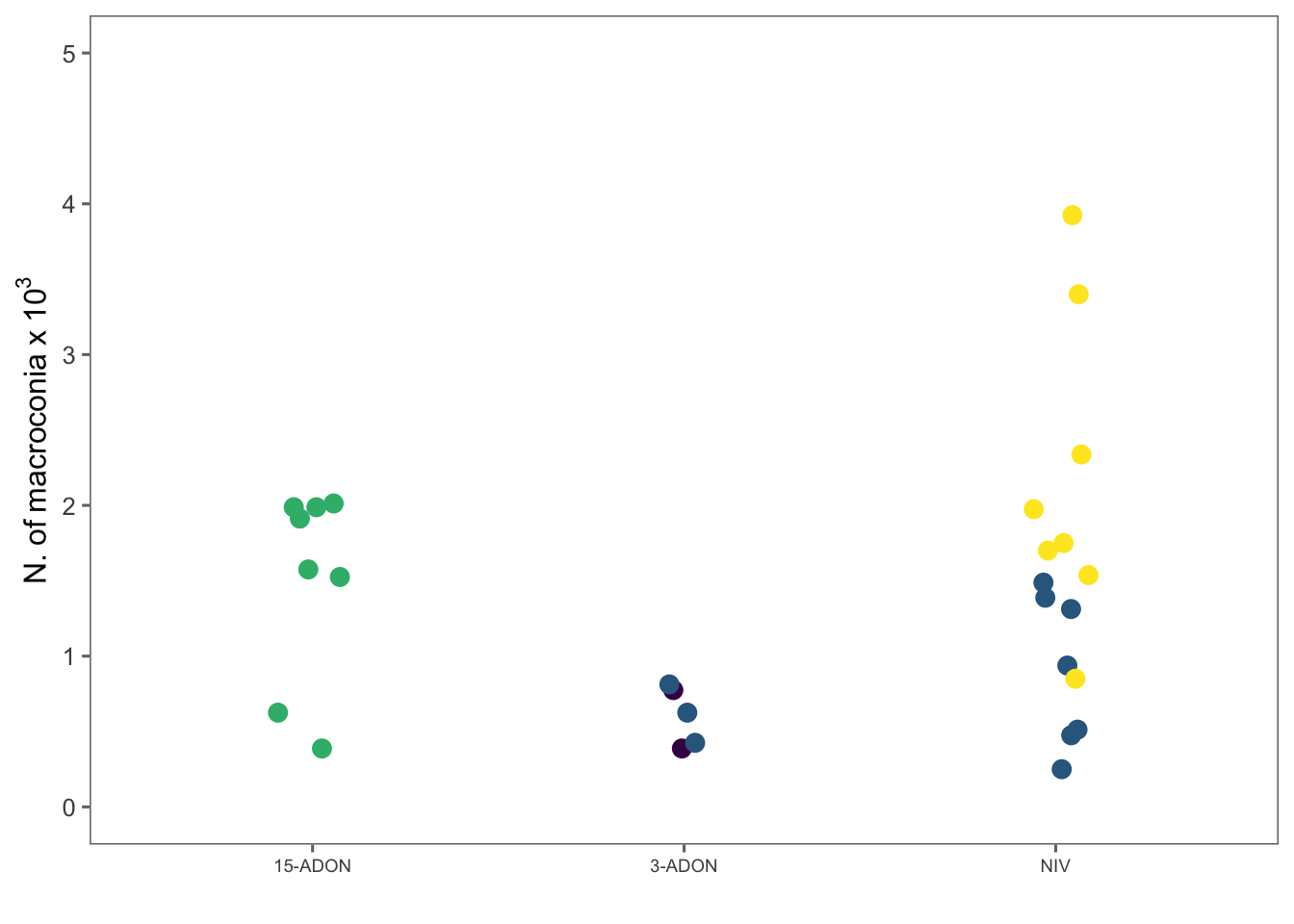
germ1 <- spor %>%
  group_by(species, genotype, isolate) %>%
  summarize(mean_germ = mean(germp))
germ <- germ1 %>%
  ggplot(aes(genotype, mean_germ, color = species)) +
  geom_jitter(width = 0.1, size = 3) +
  theme_few() +
  scale_color_viridis(discrete = TRUE) +
  theme(legend.position = "none", axis.text.x = element_text(angle = 0, hjust = 0.5, size = 7), legend.text = element_text(size = 12, face = "italic"), axis.title = element_text(size = 12)) +
  labs(x = "", y = "Germination rate (%)", color = "Species") +
  guides(colour = guide_legend(nrow = 2))
Model
Mixed model for testing the effect of genotype.
lmer_spor <- lmer(spores_ml ~ genotype + (1 | genotype / isolate), data = spor, REML = FALSE)plot(lmer_spor, type = c("p", "smooth"), col = "black")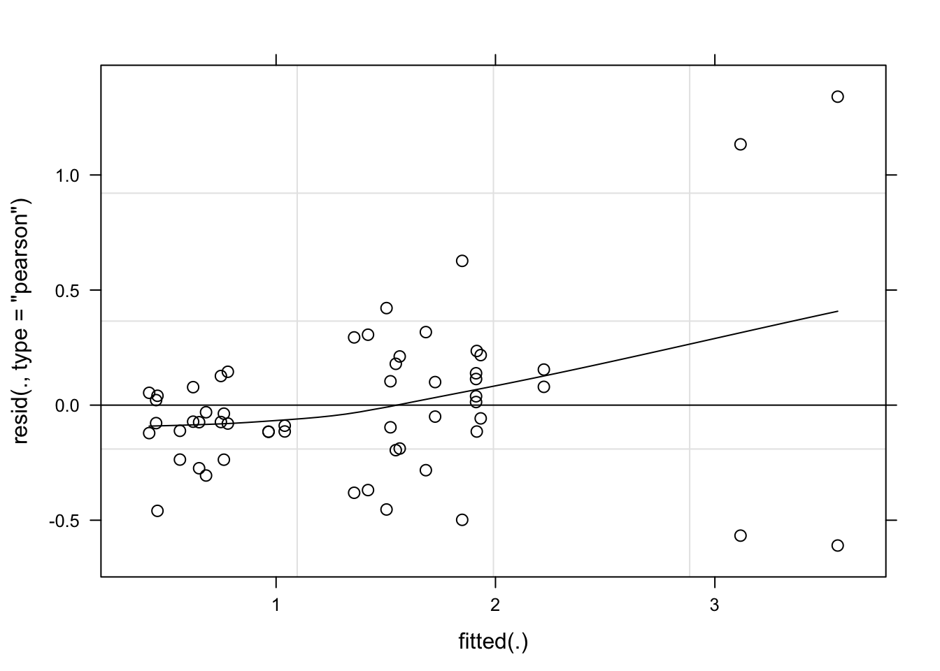
qqmath(lmer_spor, id = 0.05, col = "black")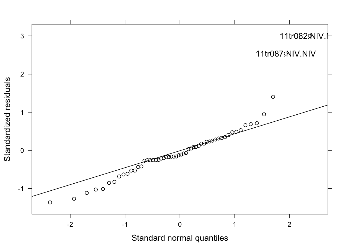
Model fitted well the data. Let’s proceed.
Anova(lmer_spor)Means comparison
medias <- emmeans(lmer_spor, ~genotype)
med <- cld(medias, Letters = LETTERS, alpha = .05)
med <- data.frame(med)
med
Figure 2
We will produce a combo figure for the three variables.
grid1 <- plot_grid(spor2, germ, labels = c("B", "C"), ncol = 2, align = "hv")

grid5 <- plot_grid(mgr1, grid1, labels = c("A"), rel_heights = c(1, 1), ncol = 1, align = "hv")
ggsave(here("figs", "figure2.png"), grid5, dpi = 600, width = 6, height = 6.2)

grid5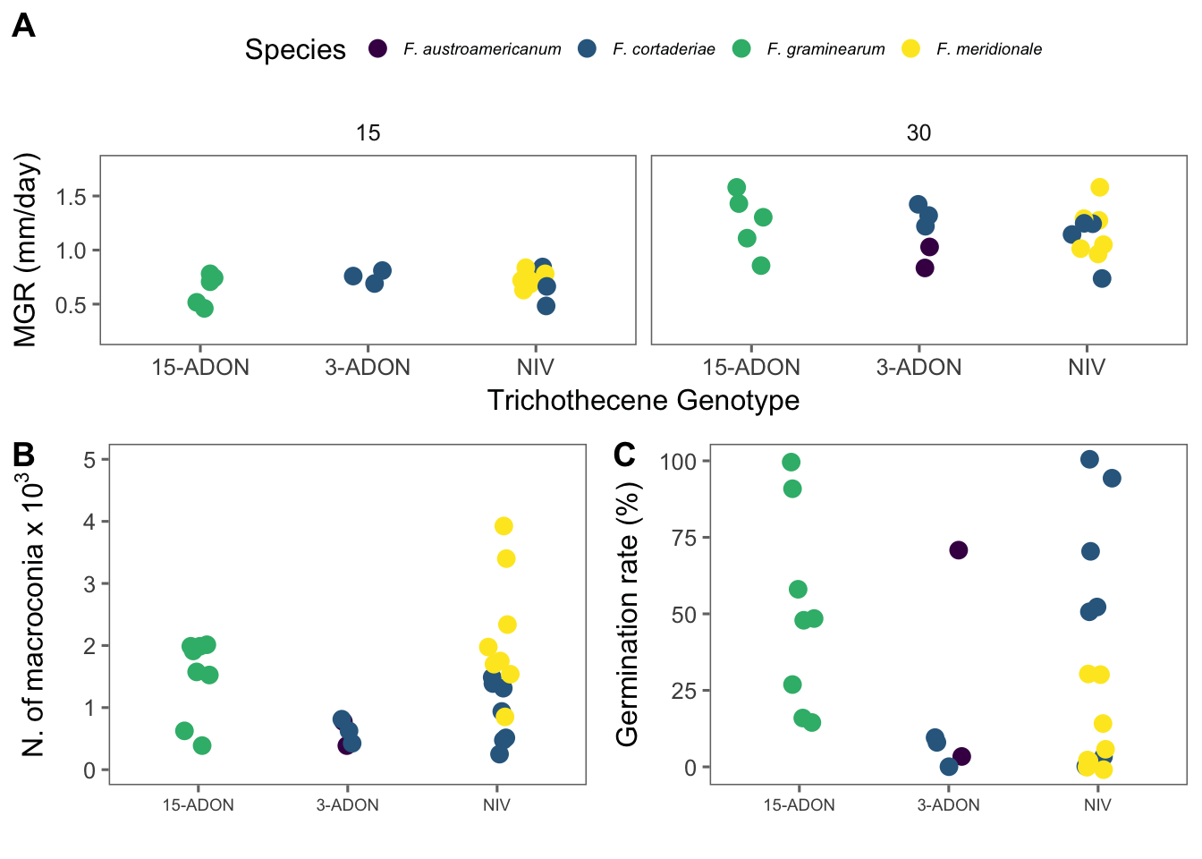
Pathogenicity
The pathogenicity was assessed based on the progress of the symptoms from the central (inoculated) spikelet. The data were transformed to percent severity of the spike (from the proportion of diseased spikelets). There is one observation of severity for each day after inoculation (dai) on individual spike.
Import
pathogen <- read_csv(here("data", "pathogenicity.csv")) %>%
  filter(isolate != "test") %>%
  select(-c(8:12))

pathogen
Transform
Since we have spikes as replicates, we will calculate the mean and standard deviation of severity for plotting purposes.
# preparing cultivar 194

pathogen_194 <- pathogen %>%
  filter(cultivar == "BRS 194") %>%
  group_by(cultivar, dai, genotype, species) %>%
  summarize(
    mean_sev = mean(sev),
    sd_sev = sd(sev)
  )

# preparing Guamirim

pathogen_Gua <- pathogen %>%
  filter(cultivar == "BRS Guamirim") %>%
  # filter(exp == 2) %>%
  group_by(cultivar, dai, genotype, species) %>%
  summarize(
    mean_sev = mean(sev),
    sd_sev = sd(sev)
  )
Visualize temporal progress
brs194 <- pathogen_194 %>%
  group_by(dai, genotype, species) %>%
  ggplot(aes(dai, mean_sev, color = species, shape = genotype, group = interaction(species, genotype))) +
  geom_point(position = position_dodge(width = 0.9)) +
  geom_line() +
  geom_errorbar(
    aes(min = mean_sev - sd_sev, max = mean_sev + sd_sev),
    width = 0.2, alpha = 0.3, position = position_dodge(width = 0.9)
  ) +
  theme_few() +
  ylim(0, 55) +
  xlim(0, 25) +
  theme(legend.position = "right", legend.text = element_text(size = 9, face = "italic")) +
  scale_color_viridis(discrete = TRUE) +
  labs(
    shape = "Genotype",
    color = "Species",
    y = "FHB severity (%) ", x = "Days after inoculation",
    color = "species"
  )

brsgua <- pathogen_Gua %>%
  group_by(dai, genotype, species) %>%
  ggplot(aes(dai, mean_sev, color = species, shape = genotype, group = interaction(species, genotype))) +
  geom_point(position = position_dodge(width = 0.9)) +
  geom_line() +
  geom_errorbar(
    aes(min = mean_sev - sd_sev, max = mean_sev + sd_sev),
    width = 0.2,
    alpha = 0.3,
    position = position_dodge(width = 0.9)
  ) +
  theme_few() +
  theme(legend.position = "none") +
  scale_color_viridis(discrete = TRUE) +
  ylim(0, 55) +
  xlim(0, 25) +
  labs(
    shape = "Genotype",
    color = "Species",
    y = "FHB severity (%) ",
    x = "Days after inoculation",
    color = "species"
  )

fig3 <- plot_grid(brsgua, brs194, labels = c("A", "B"), rel_widths = c(0.7, 1), ncol = 2, align = "hv")
ggsave(here("figs", "figure3.png"), fig3, dpi = 600, width = 9, height = 4)

fig3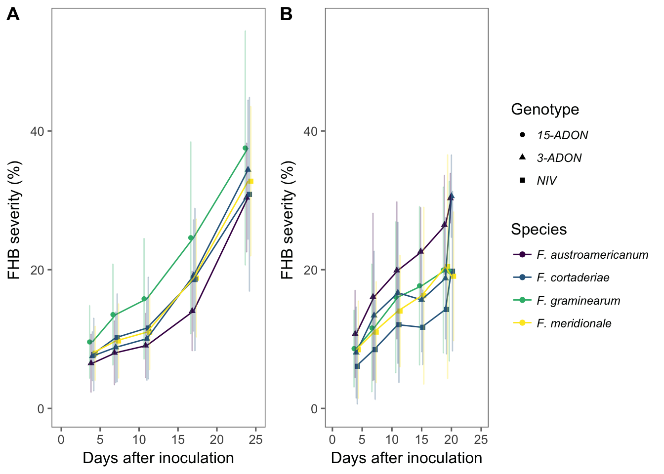
Visualize AUDPC
Let’s calculate the area under the curve for each isolate. For this, we will use the audpc function of the agricolae package. First, we need to group several variables up to dai (days after inoculation). To make our life easier, lets use the do in conjunction with the tidy functions of the dplyr and broom package, respectively. This will calculate the audpc for each spike.
BRS 194
audpc_194 <- pathogen %>%
  filter(cultivar == "BRS 194") %>%
  # filter(exp == 2) %>%
  unite(species_genotype, species, genotype, sep = "_", remove = F) %>%
  select(
    exp, cultivar, dai, isolate, species_genotype, species, genotype, spike,
    sev
  ) %>%
  group_by(exp, isolate, species_genotype, species, genotype, spike, dai) %>%
  summarize(mean_sev = mean(sev)) %>%
  do(tidy(audpc(.$mean_sev, .$dai)))
names(audpc_194)[8] <- "audpc"
Now we can plot the means and standard deviation for each isolate.
audpc_194 %>%
  group_by(isolate, species, genotype) %>%
  summarize(
    mean_audpc = mean(audpc),
    sd_audpc = sd(audpc)
  ) %>%
  ggplot(aes(reorder(isolate, mean_audpc), mean_audpc, color = genotype, shape = species)) +
  coord_flip() +
  theme_few() +
  geom_point(position = position_dodge(width = 0.4)) +
  geom_errorbar(aes(min = mean_audpc - sd_audpc, max = mean_audpc + sd_audpc), position = position_dodge(width = 0.4), width = 0.2)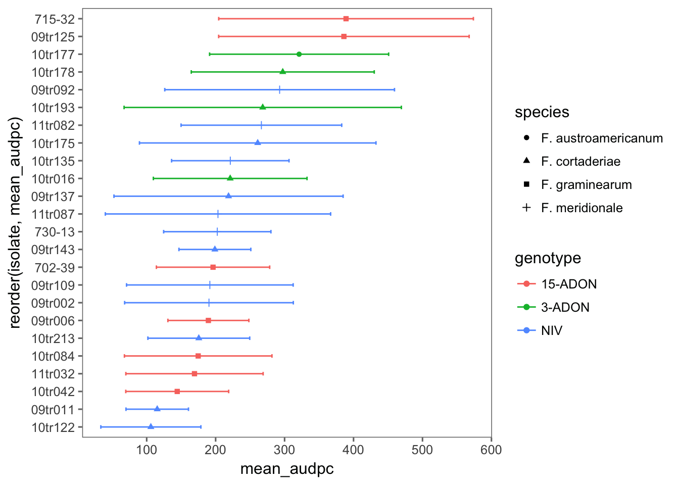
BRS Guamirim
audpc_gua <- pathogen %>%
  filter(cultivar == "BRS Guamirim") %>%
  # filter(exp == 2) %>%
  unite(species_genotype, species, genotype, sep = "_", remove = F) %>%
  select(
    exp, cultivar, dai, isolate, species_genotype, species, genotype, spike,
    sev
  ) %>%
  group_by(exp, isolate, species_genotype, species, genotype, spike, dai) %>%
  summarize(mean_sev = mean(sev)) %>%
  do(tidy(audpc(.$mean_sev, .$dai)))
names(audpc_gua)[8] <- "audpc"
Now we can plot the means and standard deviation for each isolate.
audpc_gua %>%
  group_by(isolate, species, genotype) %>%
  summarize(
    mean_audpc = mean(audpc),
    sd_audpc = sd(audpc)
  ) %>%
  ggplot(aes(reorder(isolate, mean_audpc), mean_audpc, color = genotype, shape = species)) +
  coord_flip() +
  theme_few() +
  geom_point(position = position_dodge(width = 0.4)) +
  geom_errorbar(aes(min = mean_audpc - sd_audpc, max = mean_audpc + sd_audpc), position = position_dodge(width = 0.4), width = 0.2)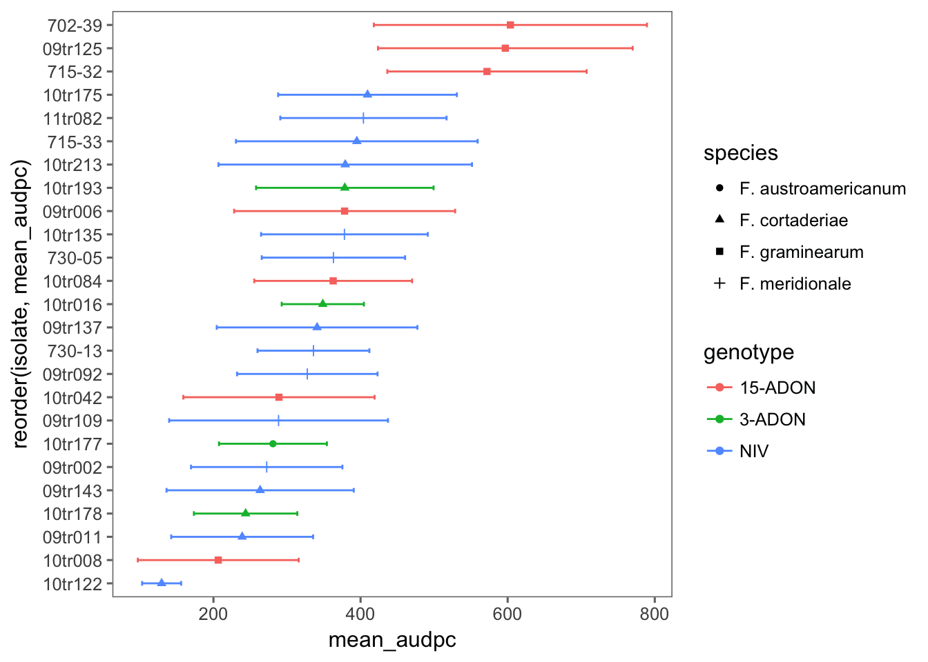
Mixed model
We fit a separate model for each cultivar because the experiments were conducted at different times. We fit a multilevel to test the effect of species_genotype as fixed effects and spikes nested within isolates as random effects. The species_genotype interaction was non-significant (not shown), and then a simpler model is used.
BRS Guamirim
mix_gua <- lmer(
  audpc ~ genotype +
    (1 | isolate / spike),
  data = audpc_gua, REML = FALSE
)

mix_gua
## Linear mixed model fit by maximum likelihood ['lmerMod']
## Formula: audpc ~ genotype + (1 | isolate/spike)
## Data: audpc_gua
## AIC BIC logLik deviance df.resid
## 3576.621 3598.451 -1782.311 3564.621 275
## Random effects:
## Groups Name Std.Dev.
## spike:isolate (Intercept) 19.03
## isolate (Intercept) 90.37
## Residual 125.15
## Number of obs: 281, groups: spike:isolate, 162; isolate, 25
## Fixed Effects:
## (Intercept) genotype3-ADON genotypeNIV
## 430.4 -116.0 -105.5Evaluate the model
plot(mix_gua, type = c("p", "smooth"), col = "black")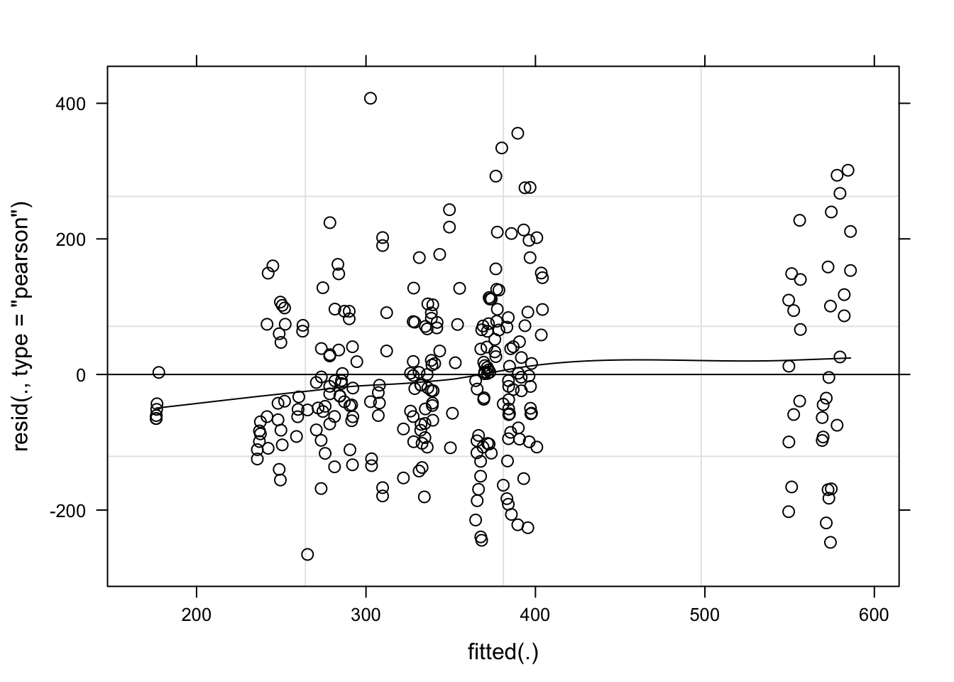
qqmath(mix_gua, id = 0.05, col = "black")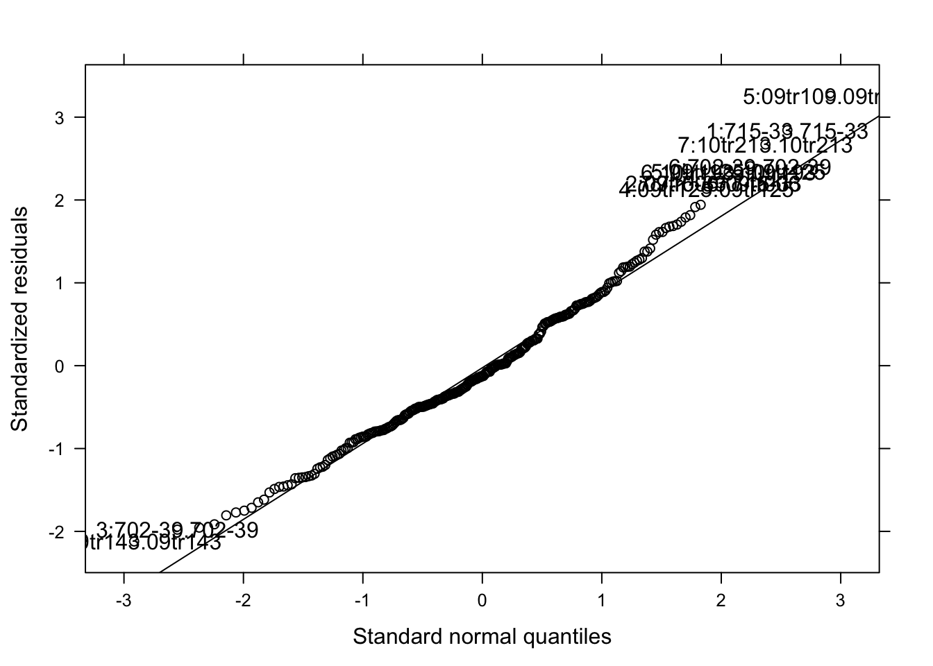
The model seems OK. Let’s check the significance of the species_genotype and estimated means.
Anova(mix_gua)means <- emmeans(mix_gua, ~ genotype)
cld(means)We can see that the variation among isolates was too large and so no difference could be detected among the five species_genotype in the moderate resistant cultivar.
BRS 194
We now apply the same model for the susceptible cultivar.
mix_194 <- lmer(
  audpc ~ genotype +
    (1 | isolate / spike),
  data = audpc_194
)
mix_194
## Linear mixed model fit by REML ['lmerMod']
## Formula: audpc ~ genotype + (1 | isolate/spike)
## Data: audpc_194
## REML criterion at convergence: 2798.188
## Random effects:
## Groups Name Std.Dev.
## spike:isolate (Intercept) 0.00
## isolate (Intercept) 58.66
## Residual 125.36
## Number of obs: 224, groups: spike:isolate, 131; isolate, 24
## Fixed Effects:
## (Intercept) genotype3-ADON genotypeNIV
## 237.00 40.40 -32.06Evaluate the model.
plot(mix_194, type = c("p", "smooth"), col = "black")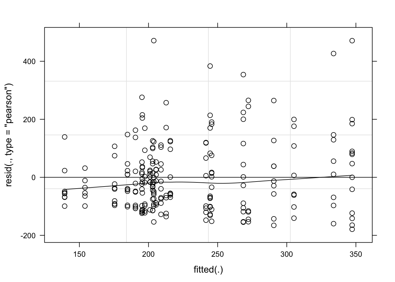
qqmath(mix_194, id = 0.05, col = "black")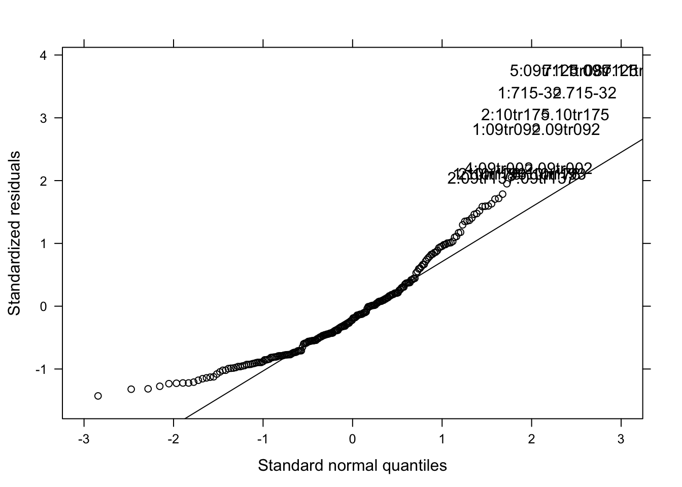
Note: I used both the original and the log-transformed audpc and the results were the same. Hence, I kept the original data.
Anova(mix_194)means <- emmeans(mix_194, ~ genotype)
cld(means)Again, the effect of species_genotype was not significant due to large variation among isolates.
Fungicide sensitivity
The response variable is the EC50 estimated in two experiments (true replicates) for each selected isolate from each species_genotype.
Import
ec50 <- read_csv(here("data", "ec50.csv"))
ec50
Summarize
Let’s obtain the mean and standard deviation of ec50 for each strain.
ec502 <- ec50 %>%
  unite(species_genotype, species, genotype, sep = "_", remove = F) %>%
  group_by(isolate, species, genotype, species_genotype) %>%
  summarize(
    mean_ec50 = mean(ec50),
    sd_ec50 = sd(ec50)
  )
ec502
Visualize
Let’s have a look at the mean EC50 for each isolate.
ec502 %>%
  ggplot(aes(reorder(isolate, mean_ec50), mean_ec50, shape = species, color = genotype)) +
  geom_point() +
  geom_errorbar(aes(min = mean_ec50 - sd_ec50, max = mean_ec50 + sd_ec50), width = 0.2) +
  theme_few() +
  coord_flip() +
  theme(
    legend.position = "right", axis.text.y = element_blank(),
    legend.text = element_text(size = 7, face = "italic")
  ) +
  ylim(0, 1.8) +
  scale_color_viridis(discrete = TRUE) +
  labs(y = (expression(paste("EC"[50], " (", mu, "g/ml)"))), x = "FGSC strain", shape = "Species", color = "Genotype") +
  ggsave(here("figs", "figure4.png"), dpi = 600, width = 4.5, height = 3)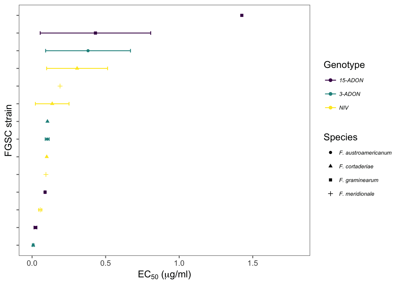
Developed by Emerson Del Ponte.